Concept / Idea
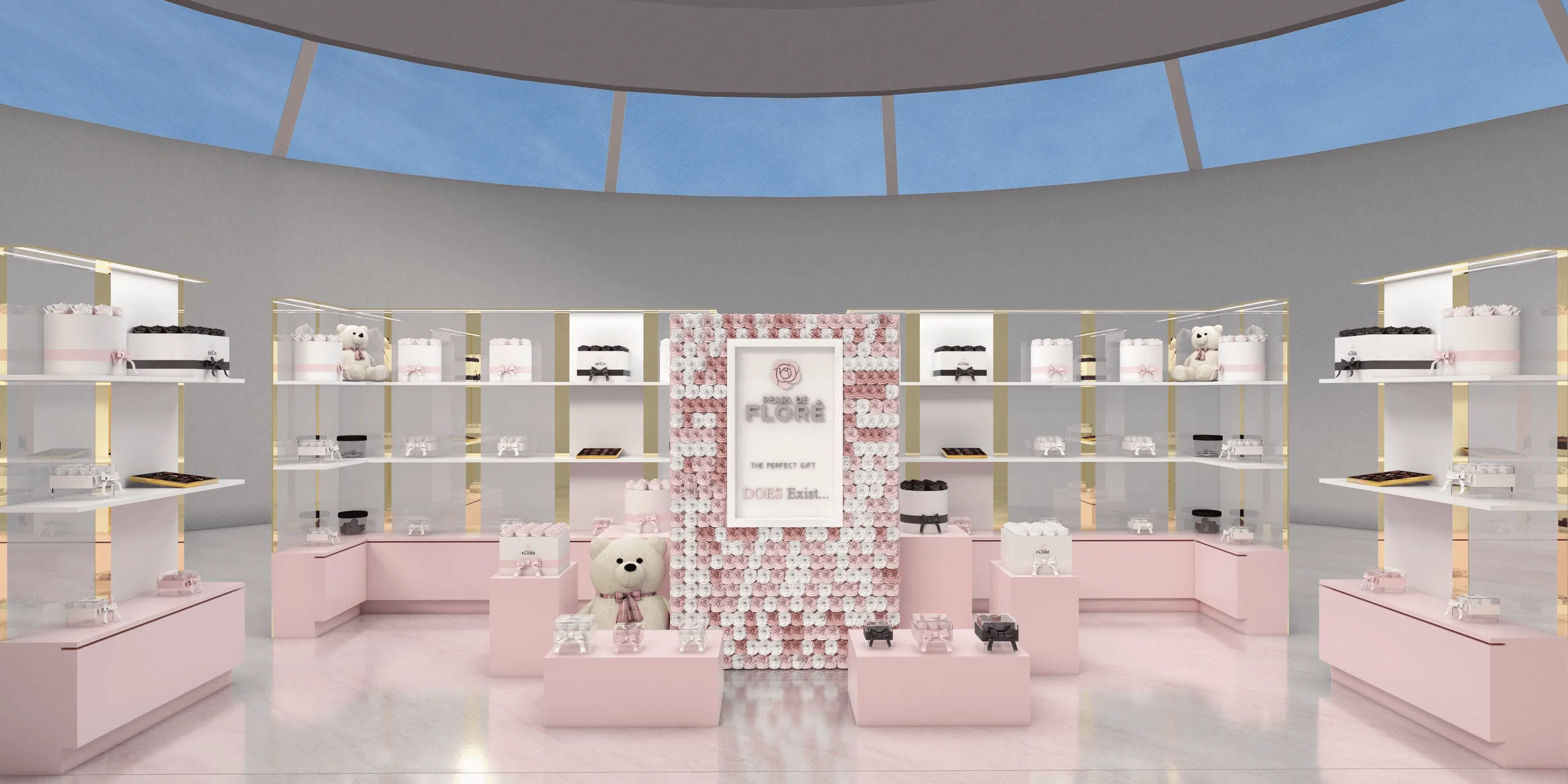
The Pearl de Floré Expo Stand was designed as a luxury retail exhibition space for a brand specializing in flowers, chocolates, and premium gift boxes.
The design concept emphasizes elegance, softness, and emotional appeal, using a pastel pink palette and clean geometric volumes to highlight the delicacy of the products.
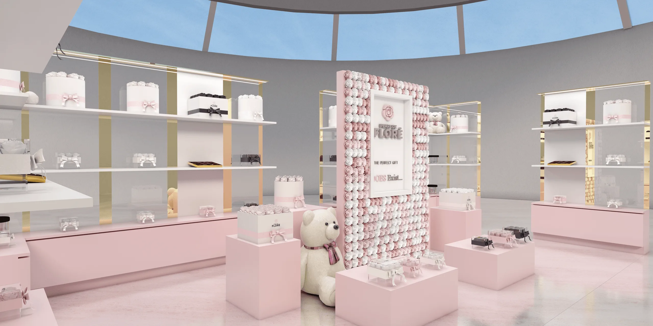
The stand merges architectural simplicity with playful visual charm, featuring a wall made of rose textures that enhances the brand identity.
Every display module was designed to elevate the products — especially floral boxes and teddy bears — turning the stand into a romantic boutique atmosphere within an expo setting.
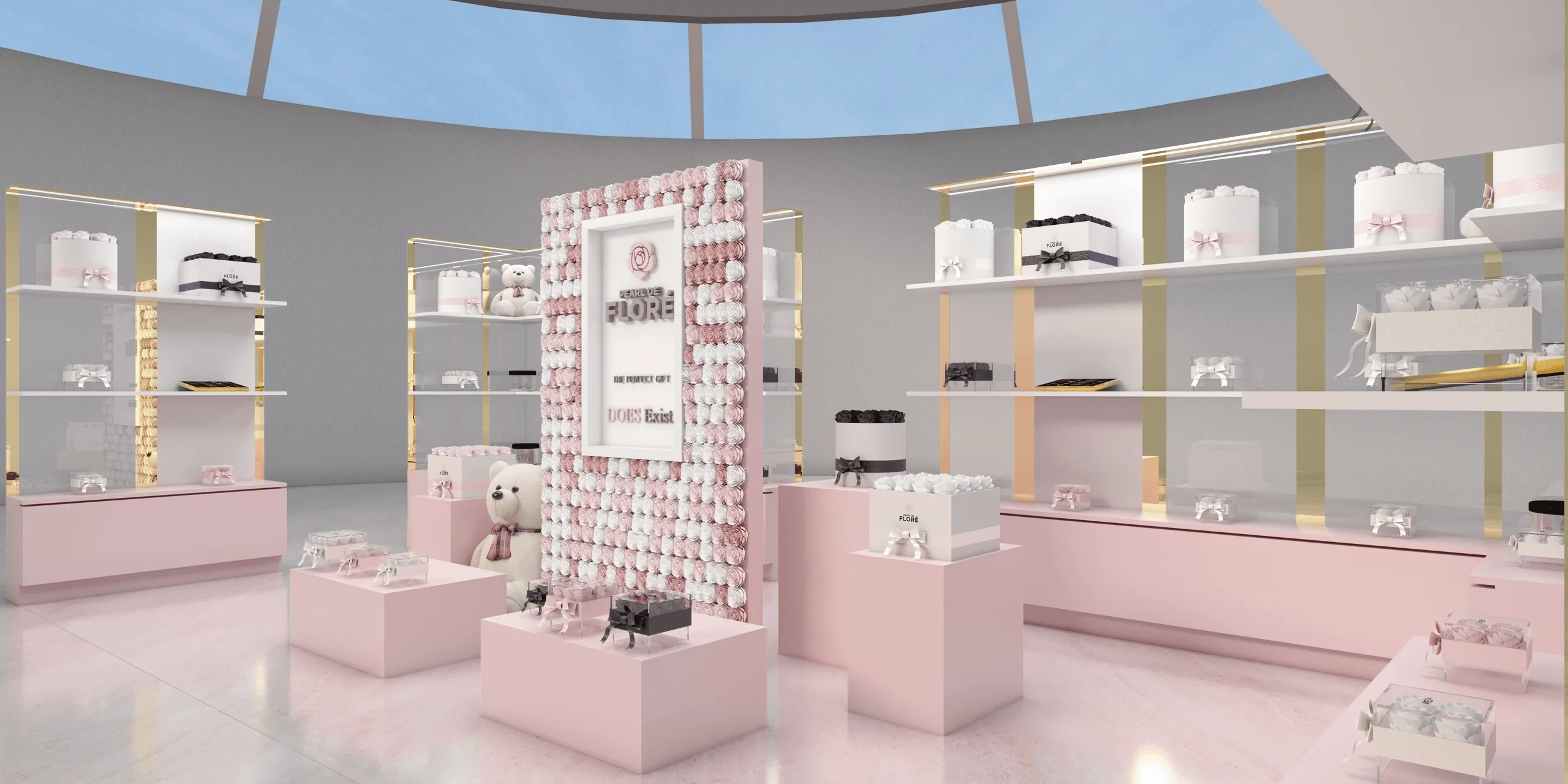
Lighting plays a key role in defining the space: soft, diffused illumination combined with reflections from marble flooring creates a sense of sophistication and depth, making the products appear both precious and approachable.
Objectives
- Develop a brand-driven stand design for exhibition presentation.
- Use pastel pink tones and floral patterns to reflect brand elegance.
- Combine solid geometric display forms with minimal structures.
- Ensure optimal lighting and visibility for every showcased product.
- Create a welcoming boutique-like atmosphere within the expo environment.
Process
Modeled in SketchUp, rendered with V-Ray, and finalized in Adobe Photoshop, the project was built around precise spatial organization and product hierarchy.
Workflow summary:
- Initial concept development based on client’s brand identity and target demographic.
- Design iteration focusing on balance between visual calm and emotional warmth.
- Integration of custom display elements designed for easy assembly during the expo.
- Lighting and material simulation for marble, metal, and glass reflections.
- Final visualization for realistic presentation and brand storytelling.
Outcome / Key Features
- Pastel pink color palette representing femininity and delicacy.
- Geometric modular display units for structured product organization.
- Floral feature wall symbolizing brand luxury and attention to detail.
- Marble flooring and gold highlights enhancing overall refinement.
- Teddy bear and flower box displays creating a warm emotional tone.
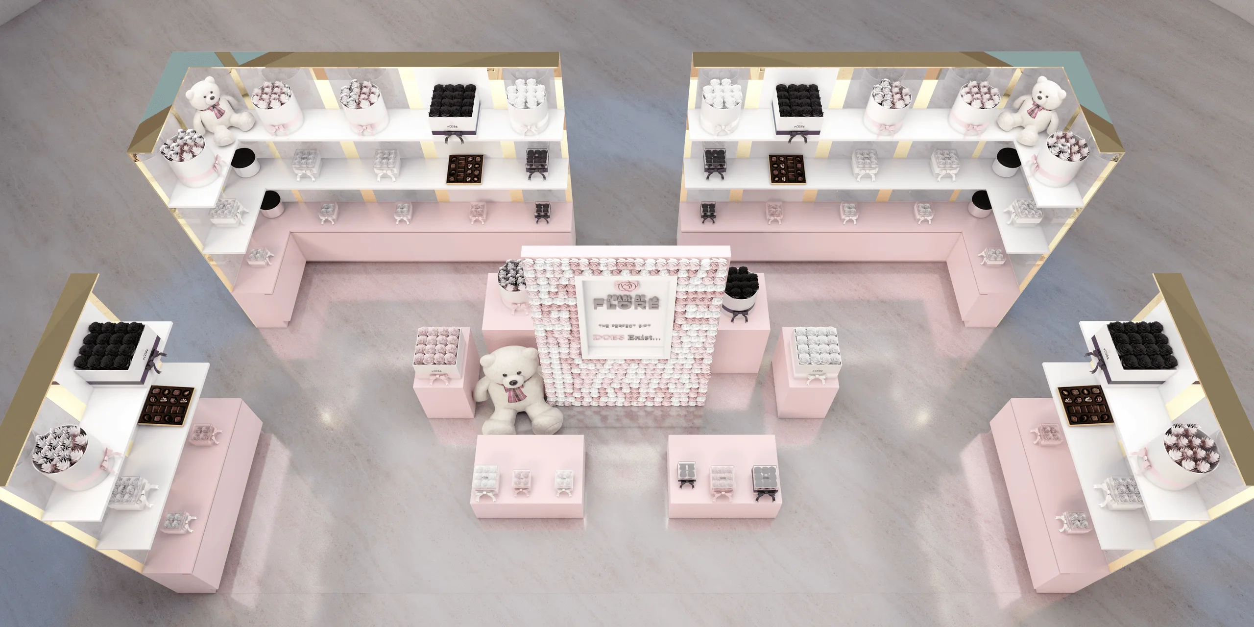
- Symmetrical layout ensuring visual balance and efficient flow.
Tools
- Modeling: SketchUp
- Rendering: V-Ray
- Post-Production: Adobe Photoshop
Visuals
- Central view showcasing the brand wall and product hierarchy.
- Side perspectives highlighting geometric symmetry.
- Overhead view showing full spatial organization and circulation.
- Lighting composition emphasizing product visibility and warmth.
*Project completed for Pearl de Floré, USA — a romantic and elegant expo stand blending floral aesthetics, soft geometry, and brand storytelling.*
Full project presentation and HD renders available on Behance:
Reference
This project was completed for Pearl de Floré, a luxury flower and gift brand known for its elegant presentation boxes and timeless aesthetic.
The collaboration focused on translating the brand’s refined identity into a physical exhibition environment, maintaining visual consistency with their official online presence:
www.pearldeflore.com
For business inquiries and brand collaboration, you can reach them directly via their contact section on the website.
You may also like
Planning a similar project?
Share a short project brief. This portfolio project will be attached to your inquiry automatically.
Discuss a project